The all-in-one app for medial resources.
Omnio started out as an iPad app and eventually expanded to include iPhone and Android. When the first version of the iPhone and Android apps were released, ratings and reviews were less than stellar (2 stars). Users were very vocal about their frustrations and some even switched to competitor apps.
The biggest complaints from users were: they couldn’t find their paid resources, it took longer to get to the content, the UI was distracting from the content (decreasing the readability of their resources), and the Android app felt too much like an iPhone app. Here’s how we addressed these issues and pulled ratings up to 4.5 stars.
Deliverables
- App Design
- Prototype
- Specs Documentation
Role
- Visual Design
- UI/UX Design
Simplified Navigation
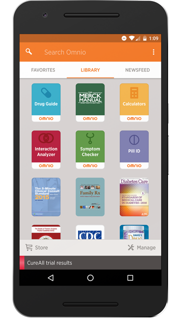
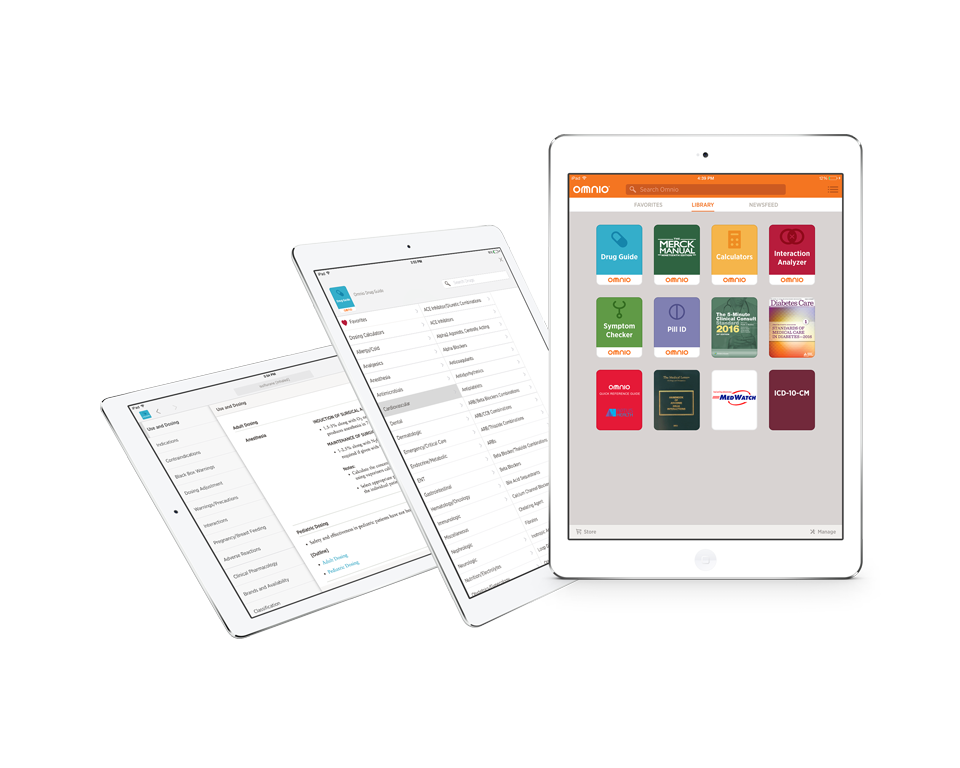
Users spend most of their time using their library resources. So we centered the attention of the new home page on the Library for one-tap access resources, but kept Favorites and Newsfeed both a swipe away.
Customizable Library
Adaptive layout was utilized to better maximize the space on each device. Replacing list view with a grid view not only made more covers visible on screen, it also emphasized better visual appeal by more prominently featuring each resource’s cover art. We also implemented user requests to remove and re-order their library resources.
Revamped Favorites
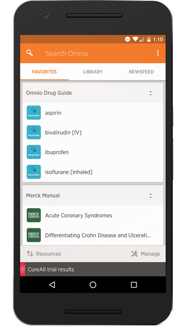
The previous app allowed users to create multiple pages of saved bookmarks; however, analytics showed that only a small handful of users took advantage of this feature. So we simplified My Pages to Favorites, allowing users to quickly add, sort, and manage shortcuts to their favorite content.
Simplified Newsfeed
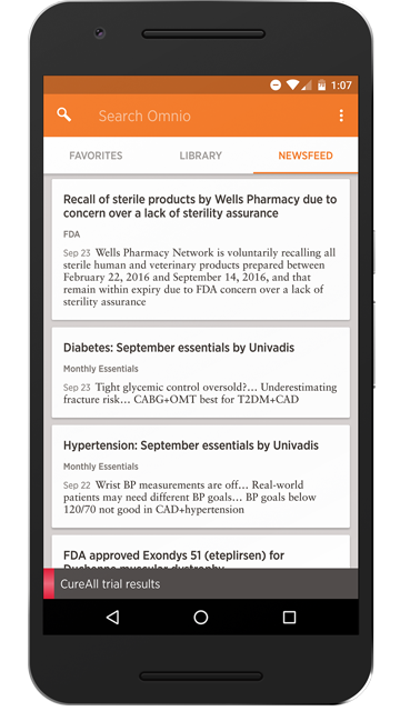
Since not many people used Journals and Topics in the previous version of the app, the Newsfeed was simplified to include only relevant news articles tailored to the user’s specialty. The overall design was also updated to reflect a more card-like layout with slight improvements to legibility.
Quicker Navigation
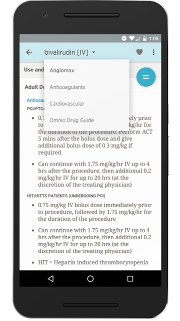
Navigation was improved by replacing unwieldy tabs with forward and back buttons, quick links, and links to related content. Readability was improved by adding a font-size setting and allowing users to view content fullscreen. Dynamic color was also added to help add more visual appeal and better differentiate between resources. The ability to favorite content with one tap was also added.
Material Design
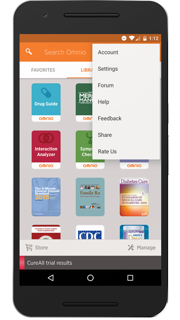
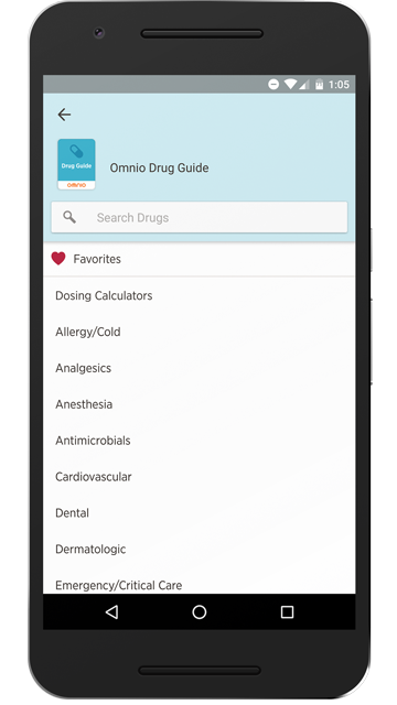
The first version of Omnio Android duplicated the iPhone experience, which caused some usability issues and complaints from users. The Android version was redesigned to better utilize native Android UI and incorporate Material Design for a more intuitive experience for Android users.
iPad Experience
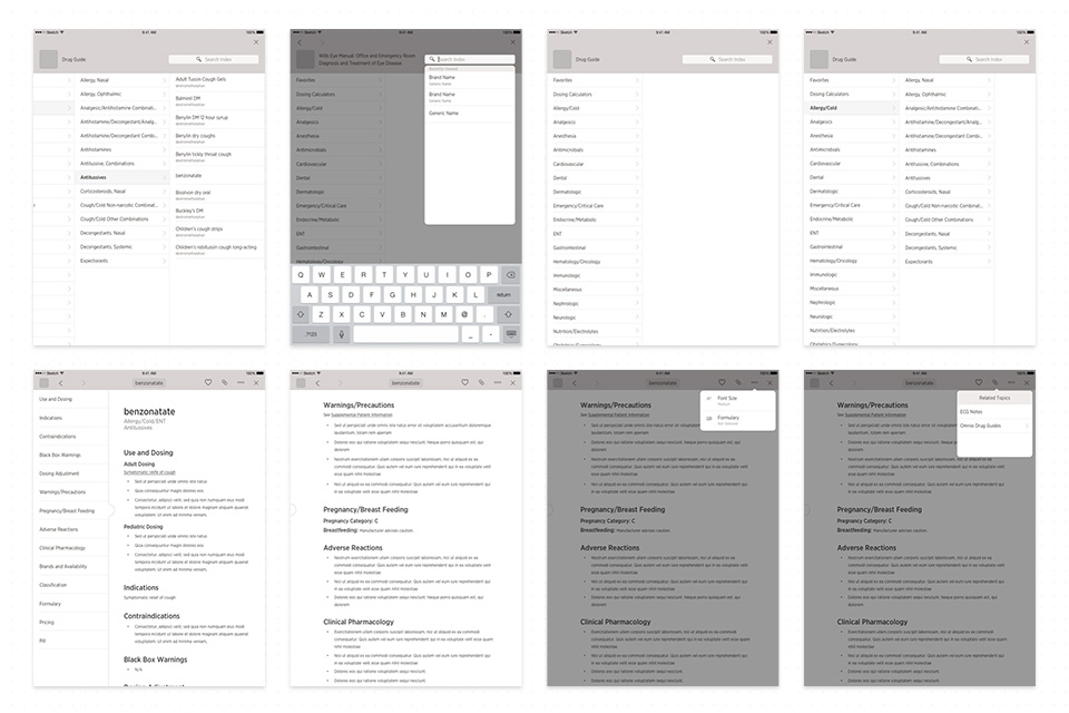
The iPad experience was also redesigned to minimize the UI and maintain consistency with the iPhone Omnio app. Adaptive layout was utilized to better maximize the space on each device.
Prototype
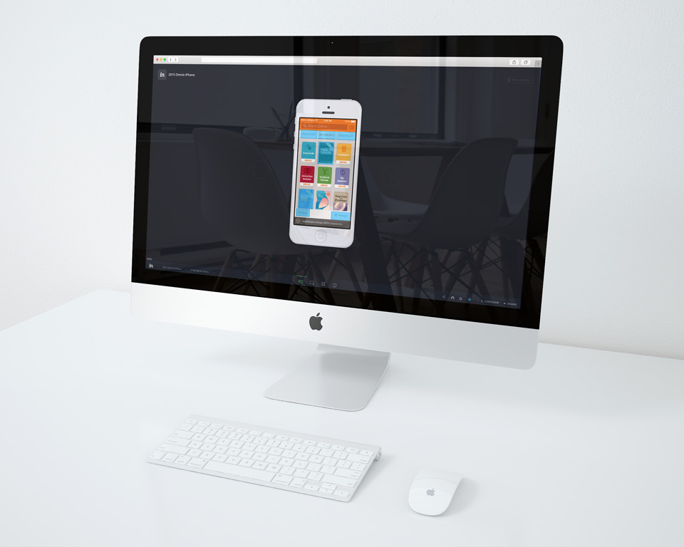
Invision was used to create several versions of prototypes for testing and demonstrating key functionality and transitions to Engineering. Keynote was used to create animated gifs that were then added to Invision to help simulate transitions.
Select Process
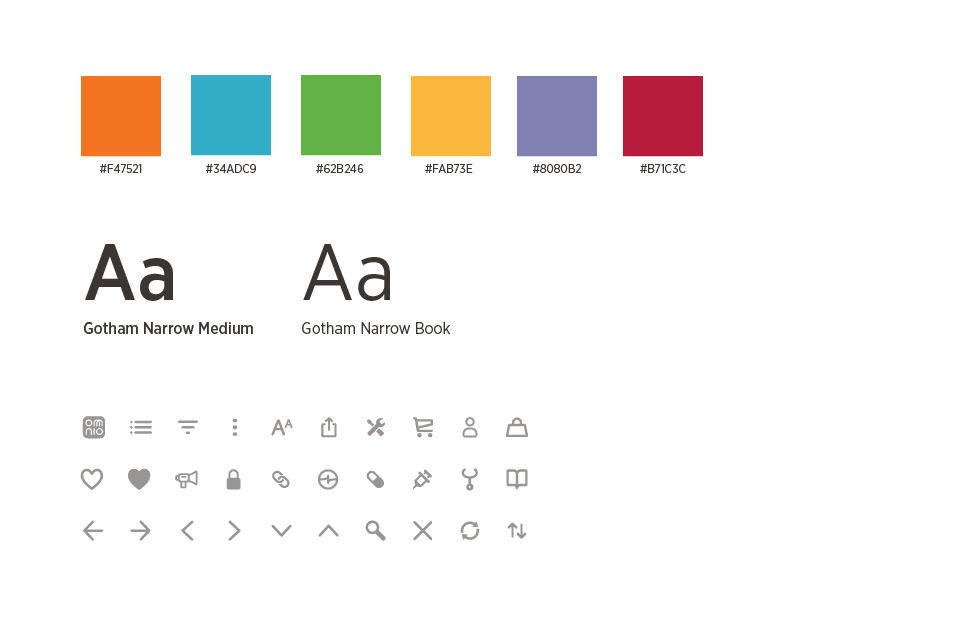
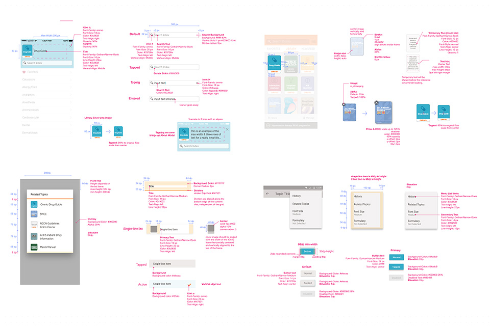
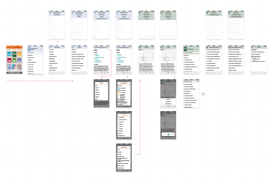
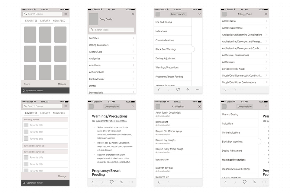
The following selection of process shots include our style guide, app structure, & hi-fi wireframes. We utilize Sketch/Zeplin for style guides, which cut production time in half. All icons were managed through the creation of an icon font.
